
One of the lovely things about doing art is how you can edit a scene or subject to make it more to your liking. As long as the ‘tonal values’ are descriptive, you can choose whatever colours you like. But more often I feel a great desire to capture aspects of the real world that attract me, and get the ‘local colour’ just right, or do it some sort of justice anyway. The emeralds are a case in point. I didn’t want to just paint pretend-emeralds (they’re green, and you would guess they were emeralds because what else could they be in the 17th century?). I wanted to reproduce what I saw. We always think of realist artists as people that capture line and form. But — whatever your fondness for realism, a very broad tent of artistic representation — the choice of colours is essential to the appeal of the work. When I take photographs, it’s usually the glow of colour that grabs my eye. (Click on each picture to enlarge, if you like.) But it’s not just colour as such that I’m drawn to — on the contrary, it’s that red, that blue, that yellow. I’m very fussy about colour in my art, and I’m very sensitive to it as a viewer of other people’s.


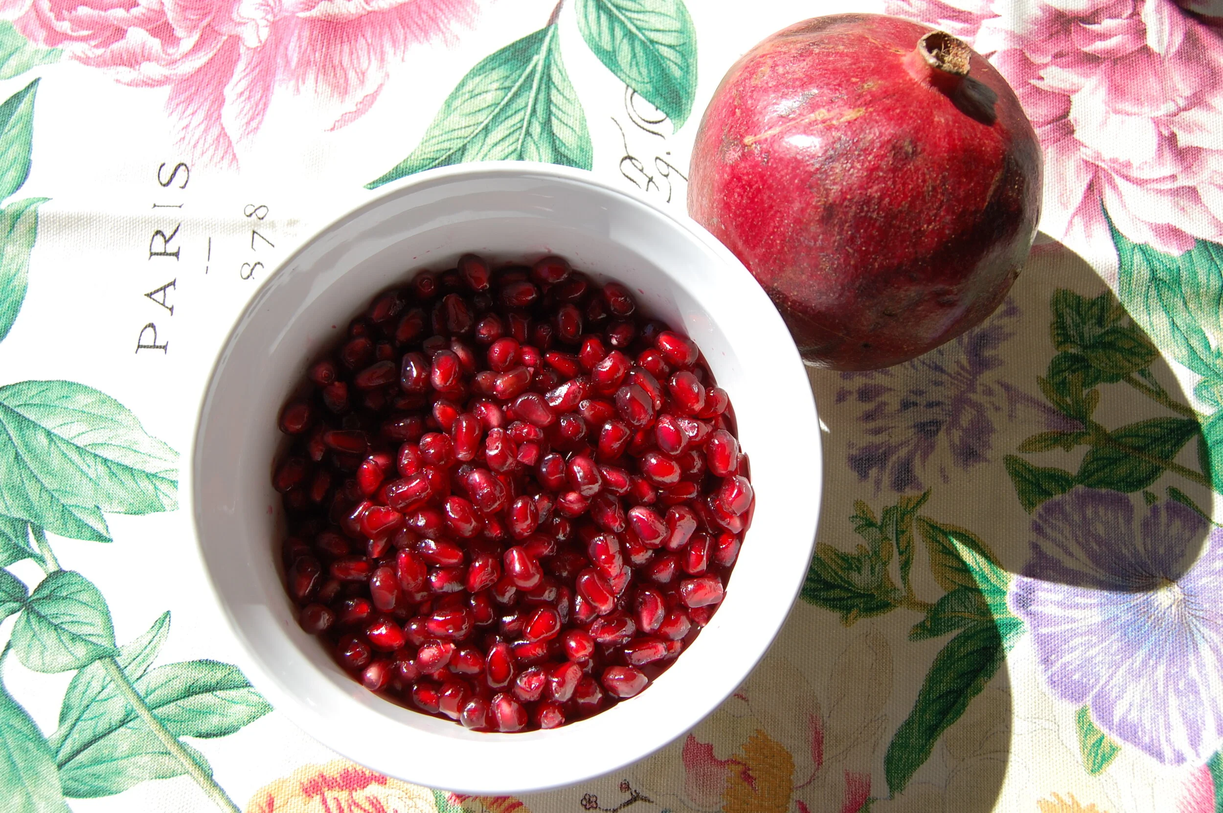

Top row: tea light candles in glass; rose bowl and paper light string; saffron threads in hot water; last moments of sunset over mountains. Bottom: Butterfly-pea infusion; palm tree flower; pomegranate; light thrown from a prism.