The year is 1968 -- except that it isn't, really, as this first appearance of Columbo on anyone's screen was filmed some time in 1967. There is something cool, strange, and ever so slightly fraudulent about 1967. And 1968, for that matter. Does this telefilm partake of that strange, colourful, compelling time? You betcha.
For one thing, it’s got a wonderful James-Bondsy jazz score (thank you, Dave Grusin, who is oddly not listed in the credits). The scene near the end, when our villain, played by Gene Barry, drives his car to a place where Columbo is waiting for him, is a gorgeous aural interlude.
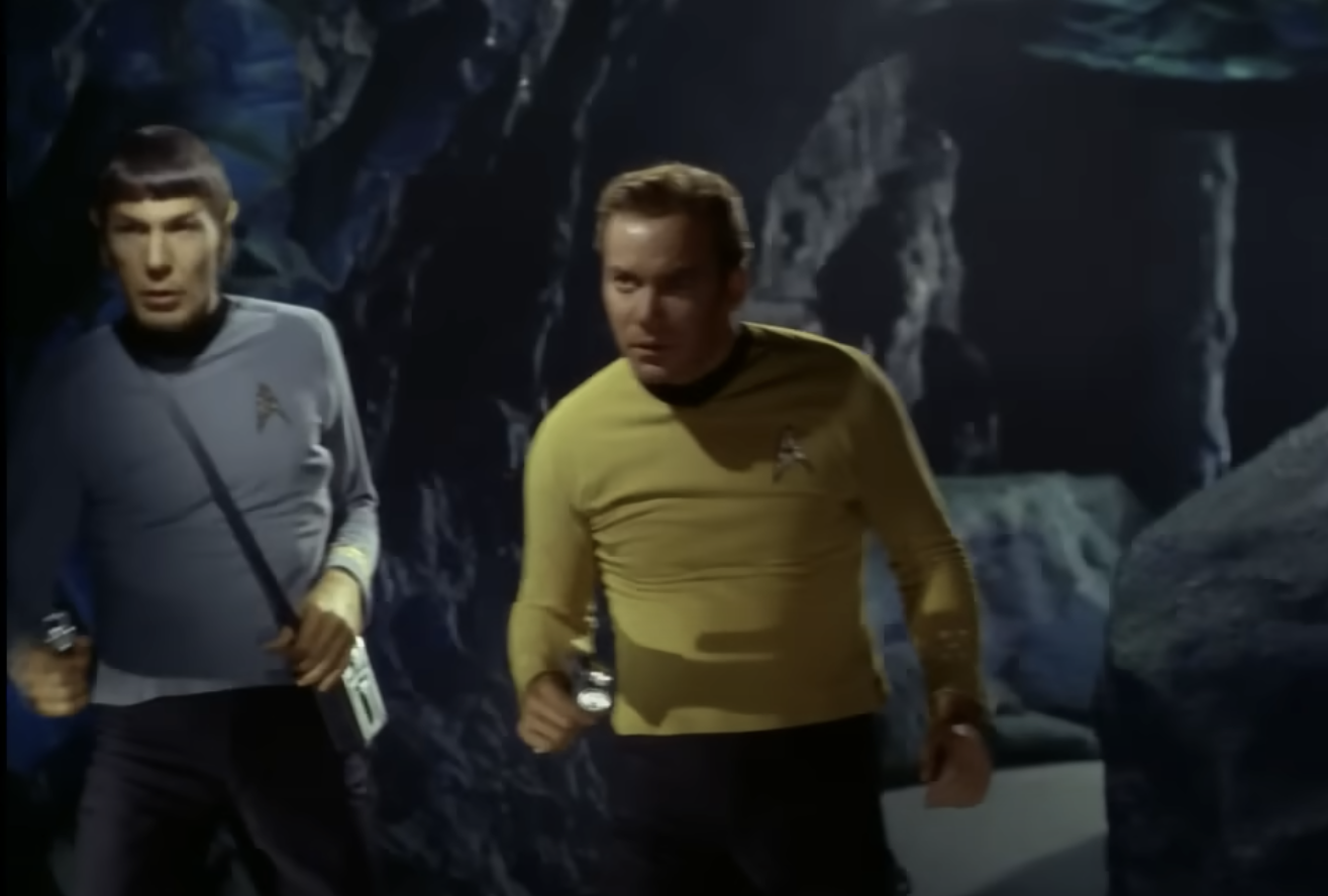
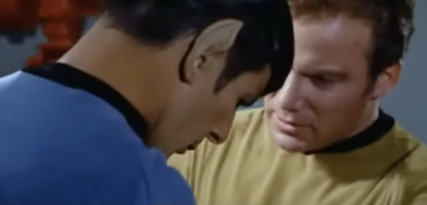
But it’s not just the sound: it’s the look. Think of Star Trek, the original and definitive Star Trek of the same era. Freeze any of the frames, and virtually every one could be a poster: the figure groupings, the lighting, the colours: the composition, in fact. That show wasn’t just staged, staffed, and filmed: it was art-designed. It’s a production of immense physical beauty. Some of the plots may have been ludicrous, and some of the special effects would make the young-uns of today die laughing. But so what? Star Trek was sleek and it had something to say, especially in its more knowing political and philosophical episodes. I mention this because Prescription: Murder has a similar designed feel: a similar beauty. It’s not that we necessarily admire the characters’ taste -- when were any of these lavish but oddly ersatz LA mansions really my style, except maybe for the house of the conductor in the Cassavetes/Blythe Danner episode, Etude In Black (1972), and the huge sun-room in the Ruth Gordon episode, Try And Catch Me (1977)? Rather I mean the look of the Sixties, in a general way: the style and smartness of the clothing, the greater formality compared with later decades and especially the twenty-first century. The extended moment when Columbo, his back to us, addresses in uncompromising terms the lovely young lady -- her back also to us -- in a film studio is really captivating. We don’t see their faces, for that minute, and we don't need to: their expressive backs and his words say everything. And the mix of colors -- pink, dark blue, marbley lights; the warm brown of his briefcase; the sober grey of his suit -- makes the whole thing look gorgeous. A poster, if only you could print it and frame it.
And that’s another thing: the framing. As a director, Woody Allen is famed for his visual framing: for instance, the bar of the car frame that separates the windscreen from the driver’s window, visually dividing the people inside: at once an expression and confirmation of the division we know they’re feeling. Allen is very good at this. But so was the director of Prescription: Murder. Note for instance the way the character of Joan Hudson, at her moment of crisis, seems to be visually pinioned between two blue square columns. A neat effect. It’s there also in the very last scene, in which Columbo and another character are separated visually from the killer, by a sliding door bar very reminiscent of Allen’s car frame. But a decade or two beforehand.


