
Fog is nothing more than ground-level clouds. Here I was looking at the distant mountains through veils of cloud, where details showed in two bands: the middle distance and the foreground. In the middle distance I saw textures, while everything around that ridge was foggy and indistinct. In the foreground I saw not only detail but crisp, bright green shapes. There is no ‘focal point’. I don’t believe that all art needs one. What art needs, in my view, is a sense of atmosphere and features — whether of colour or shape or both — that intrigue the eye.
How true to natural colour?
One of the lovely things about doing art is how you can edit a scene or subject to make it more to your liking. As long as the ‘tonal values’ are descriptive, you can choose whatever colours you like. But more often I feel a great desire to capture aspects of the real world that attract me, and get the ‘local colour’ just right, or do it some sort of justice anyway. The emeralds are a case in point. I didn’t want to just paint pretend-emeralds (they’re green, and you would guess they were emeralds because what else could they be in the 17th century?). I wanted to reproduce what I saw. We always think of realist artists as people that capture line and form. But — whatever your fondness for realism, a very broad tent of artistic representation — the choice of colours is essential to the appeal of the work. When I take photographs, it’s usually the glow of colour that grabs my eye. (Click on each picture to enlarge, if you like.) But it’s not just colour as such that I’m drawn to — on the contrary, it’s that red, that blue, that yellow. I’m very fussy about colour in my art, and I’m very sensitive to it as a viewer of other people’s.


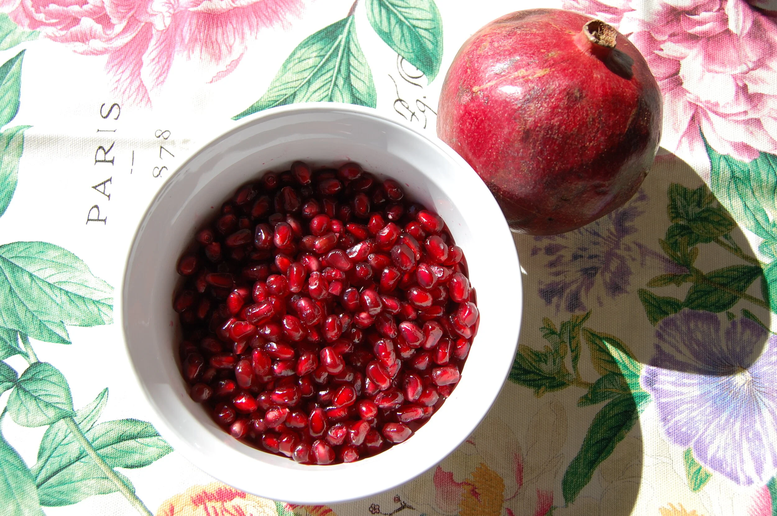

Top row: tea light candles in glass; rose bowl and paper light string; saffron threads in hot water; last moments of sunset over mountains. Bottom: Butterfly-pea infusion; palm tree flower; pomegranate; light thrown from a prism.
The magnetism of emeralds
Source object: an English 17th-century gold and white-enamelled salamander brooch, set with emeralds and diamonds. This wonderful jewel was discovered buried in London’s jewellery district of Cheapside after the Fire of London in 1666. I sketched this with the greatest attention to the emeralds, whose character fascinates me: they have depths that required indigo, one of my favourite pigments.

Water-soluble pencil sketch, summer 2018
Sketching from life plus a photo reference
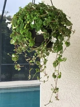
My beloved Alsobia dianthiflora.
This is the picture that kicks off my new square mixed-media sketchbook (Bee Paper Company, 6 x 6 inches). The photographic reference is Betsy herself, as a not-quite 3-and-a-half-month old puppy. That photo was taken indoors, in the evening (see picture at right). What I did was 'transfer' her (along with her beanbag) out into the lanai, where my fuschia and Alsobia dianthiflora were hanging, though not in the proximity seen here. The blue swashes between them represent the white voile curtain on the other side of the lanai door. Beyond we glimpse a shaded fence and a vague profusion of foliage -- but I'm not aiming here for precise realism or even particularly convincing perspective. What I most wanted was to capture the character of my wonderful puppy and my favourite hanging plants. The thing is, I coloured the Alsobia in muted usual olive tones because that’s how it looked at the time, even though my camera shows the leaves as more like the bright green fruitier Castelvetrano olives I’ve been known to enjoy.
Betsy indoors, with a toy I improved by tying on strips of old t-shirt!
The basic blackboard is boffo for trying out ideas
I love my blackboard — though it must be really black, so every stroke of chalk stands out crisply, and every smear of chalk means something. I use it for everything: doing sums, making lists, jotting quick thoughts about the many projects I’m always working on. And sometimes I just like to do a quick sketch. It’s only temporary, unlike my sketchbooks, but there’s a freedom in knowing that if it’s naff, you just rub it out. But that’s not even the real reason for doing chalk sketches. I think I like the ease, the fun, the sense of playfulness you have with chalk. And a swipe of the finger revises, re-works, and lets you re-observe or re-imagine. I can see doing chalk drawings as a kind of warm-up before I get my paintbox or pastels out.
The shine of gum Arabic

From my sketchbook, a favourite pitch pine tree done with my Schminke Horadam travel paintbox and a couple of Winsor & Newton tubes. (Not to mention the Daniel Smith Quinacridone Gold: how I love that colour!) And a bit of gum Arabic, a highly traditional (indeed ancient) paint binder. It gives a gloss, not that one can detect it in all lights. For purposes of illustration, you might think it would be irrelevant. And yet, it changes the handling of the paint as well, and I believe that everything you do with a picture contributes to its final affect (yes, ‘affect’, though ‘effect’ makes sense, as well). The direction of your strokes, the amount of layering, lifting, and re-working, the colour and the texture of the paper you’ve chosen, and so on. The pitch pine here looks especially summery and jolly, I think.